UX/UI Mobile Project | Hello Sugar
Overview
I designed a high-fidelity prototype of a mobile website for a fictitious business to demonstrate the ux/ui design and usability testing skills I've learned, and my knowledge of the tools used. I also designed the business' branding.
Tools
Adobe Illustrator
Adobe InDesign
Figma
Maze
Role
UX/UI Designer
Graphic Designer
Project Goal
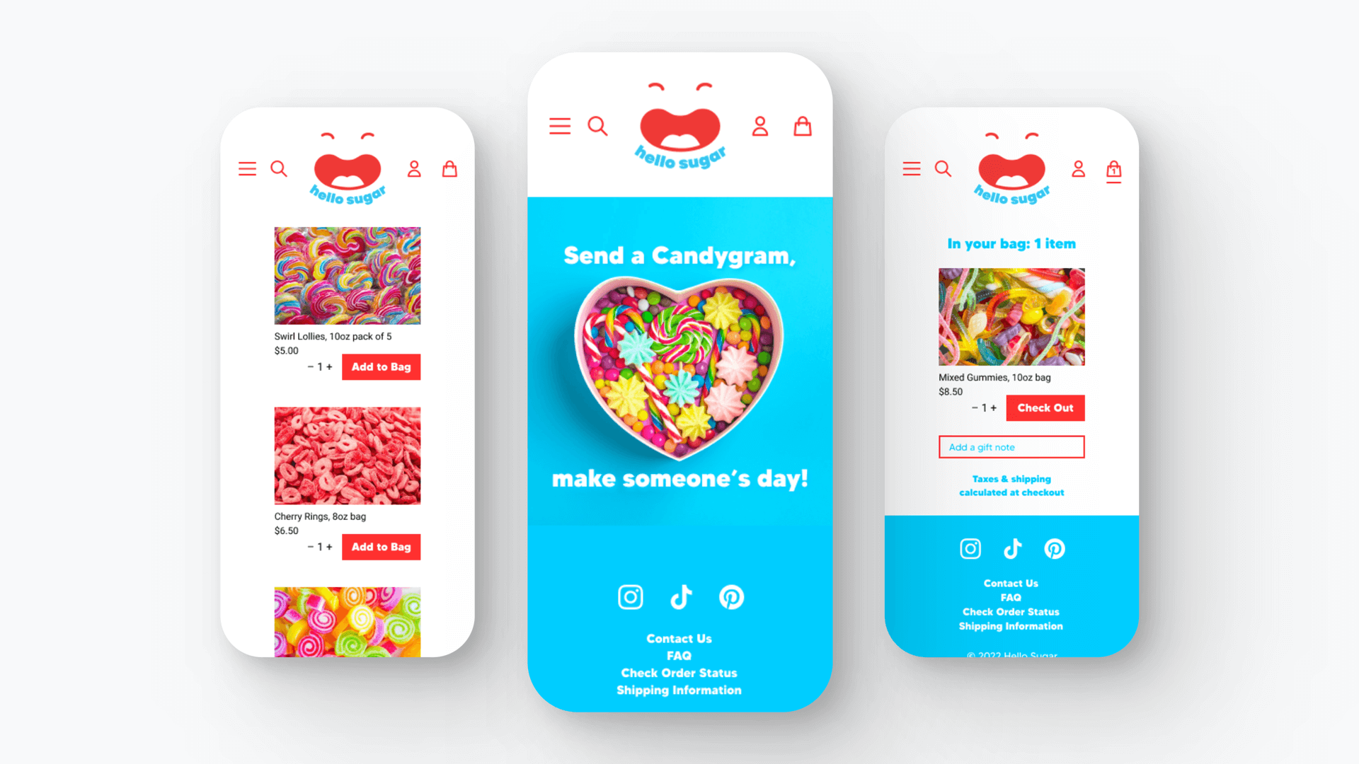
The goal of this project was to create a high-fidelity prototype of a mobile site for Hello Sugar, a fictitious online candy store, using Figma. I conducted usability testing with Maze, of the site’s key tasks and, based on user feedback, incorporated revisions to improve user experience.
Brainstorming Process
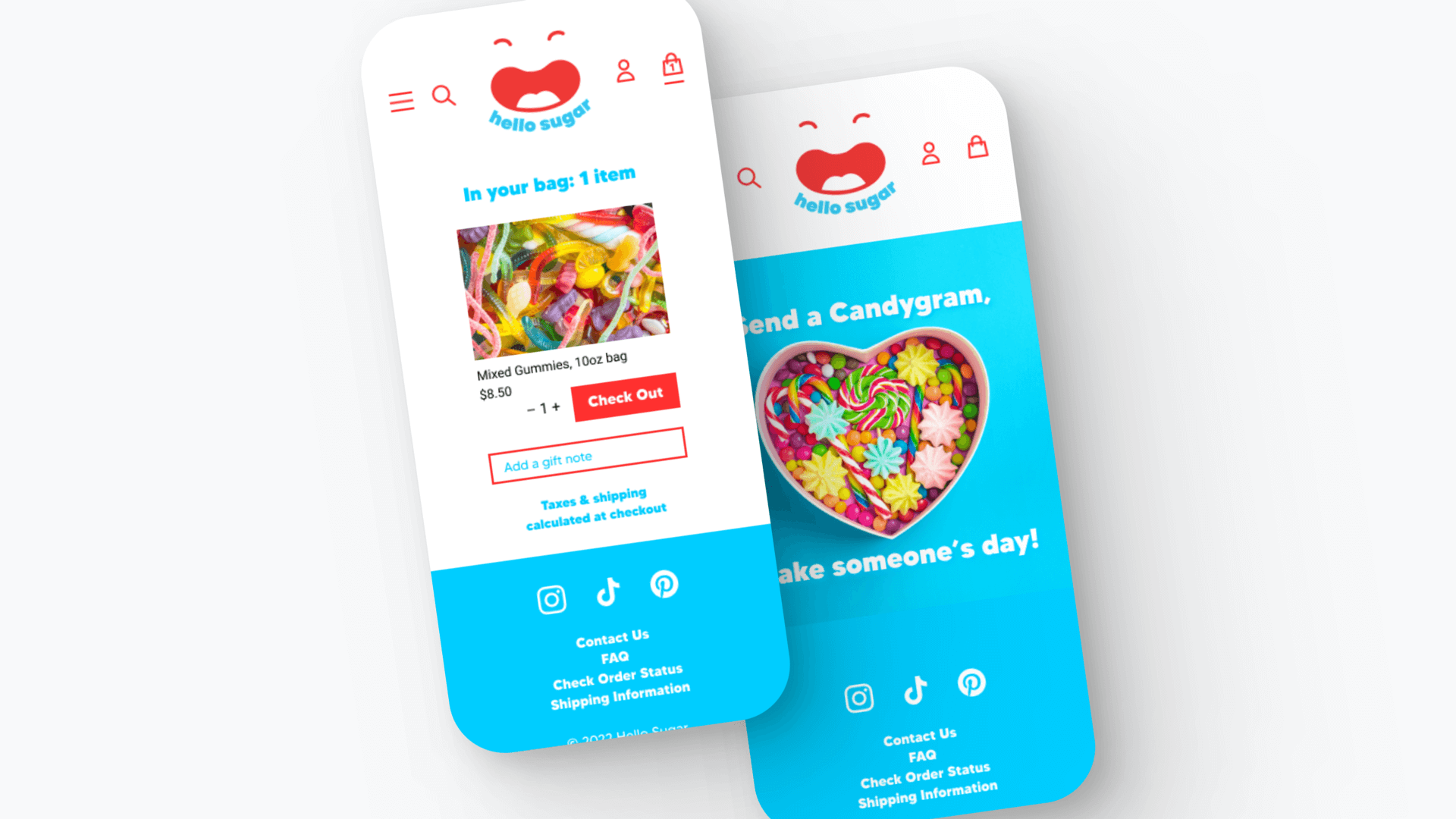
I wanted to create an enjoyable user experience by designing a fun brand and website. To achieve this, I opted for an online candy store, as this had the potential to be instantly likeable as many existing ones appear dull and cluttered. By emphasizing bold, clean design, I aimed to make the store visually striking and appealing to potential customers.
Brand Design
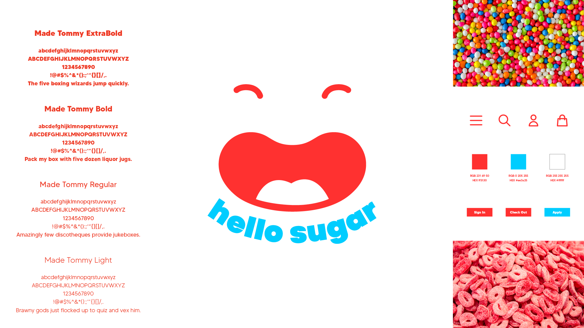
The logo design process took some exploration, as I didn’t want the result to be literal (i.e. a piece of candy). The final design exudes joy, just as the user experience and the candy will. I created a kawaii smiley face, which I paired with a chunky, sans serif lowercase font, to give a sense of informality and fun. I used a simple two-colour palette of saturated, high contrast colours to suggest the bright sugariness of a candy store.
Persona, Scenario & Flow
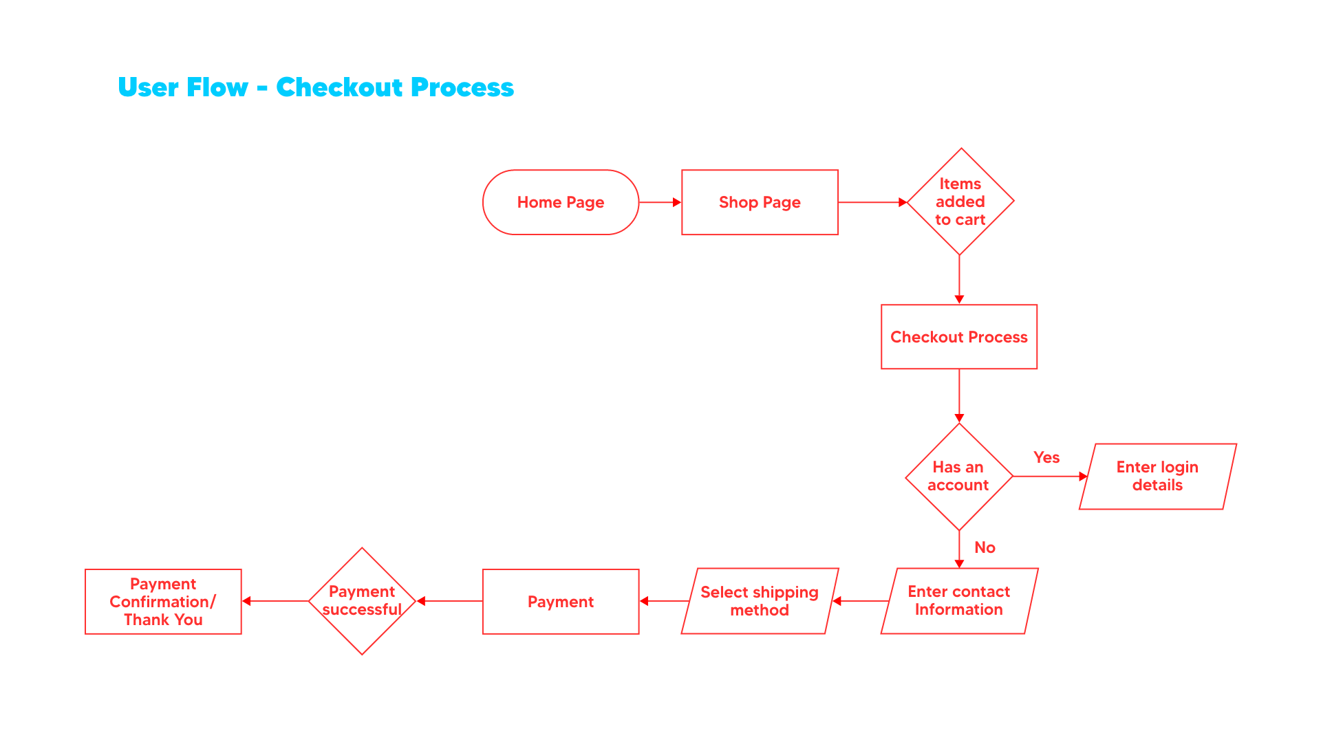
The User Persona’s goal is to add some delight to her friends' lives with surprise gifts. She's bored by her office job and shops online for a break from routine. The User Scenario describes her journey as she clicks on an ad, which takes her to the Hello Sugar site. She orders some candy as a gift and creates an account for future visits. The User Flow details her path on the website to complete the checkout process.
Prototype
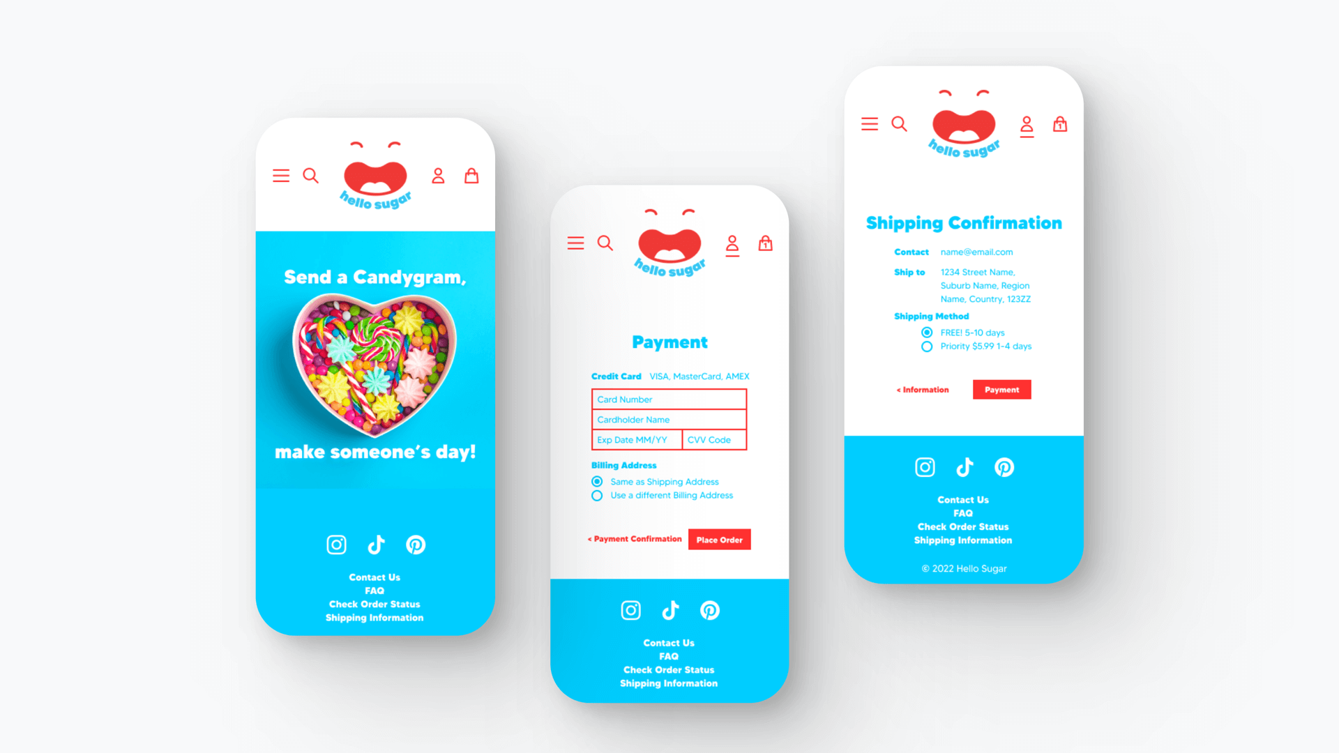
I made the high-fidelity prototype with Figma. The bright colours of the brand design, smiling logo and vividly saturated product photography set the tone for a fun shopping experience. I kept visual clutter to a minimum to decrease complexity and because of a lack of real estate on mobile devices. I selected a minimal UI icon set and used a single font family, so both would serve their function without being obtrusive, and balance out the bold logo that anchors the page.
User Testing
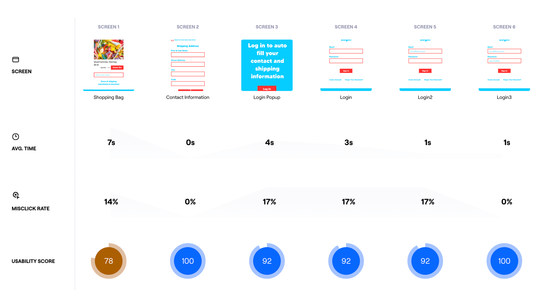
I designed and tested the prototype using Maze. Testers were mostly very satisfied. A couple of users struggled with the size of the call to action buttons and input boxes, so I increased their sizes. I also changed the text in the checkout process forms to a bolder font weight for legibility. One user wanted an indication that items had been added to the cart, so I added a digit to the icon to display the number of products added.