UX/UI Desktop Project | Popsy
Overview
A high-fidelity prototype of a desktop website for a fictitious business, to demonstrate the ux/ui design and usability testing skills I've acquired, as well as knowledge of the tools used. The entire project, including branding, was completed in under 40 hours.
Tools
Adobe Illustrator
Adobe InDesign
Adobe XD
Useberry
Role
UX/UI Designer
Graphic Designer
Project Goal
The goal was to create a high-fidelity prototype of a desktop site using Adobe XD. I usability tested the site’s key tasks and made the necessary revisions for an improved experience based on user feedback.
Brainstorming Process
I wanted to create an alcopop beverage to allow for a lighthearted and fun brand design, using lots of colour, which would still have a level of sophistication. I wanted users to find the look & feel appealing, for an enjoyable experience.
Brand Design
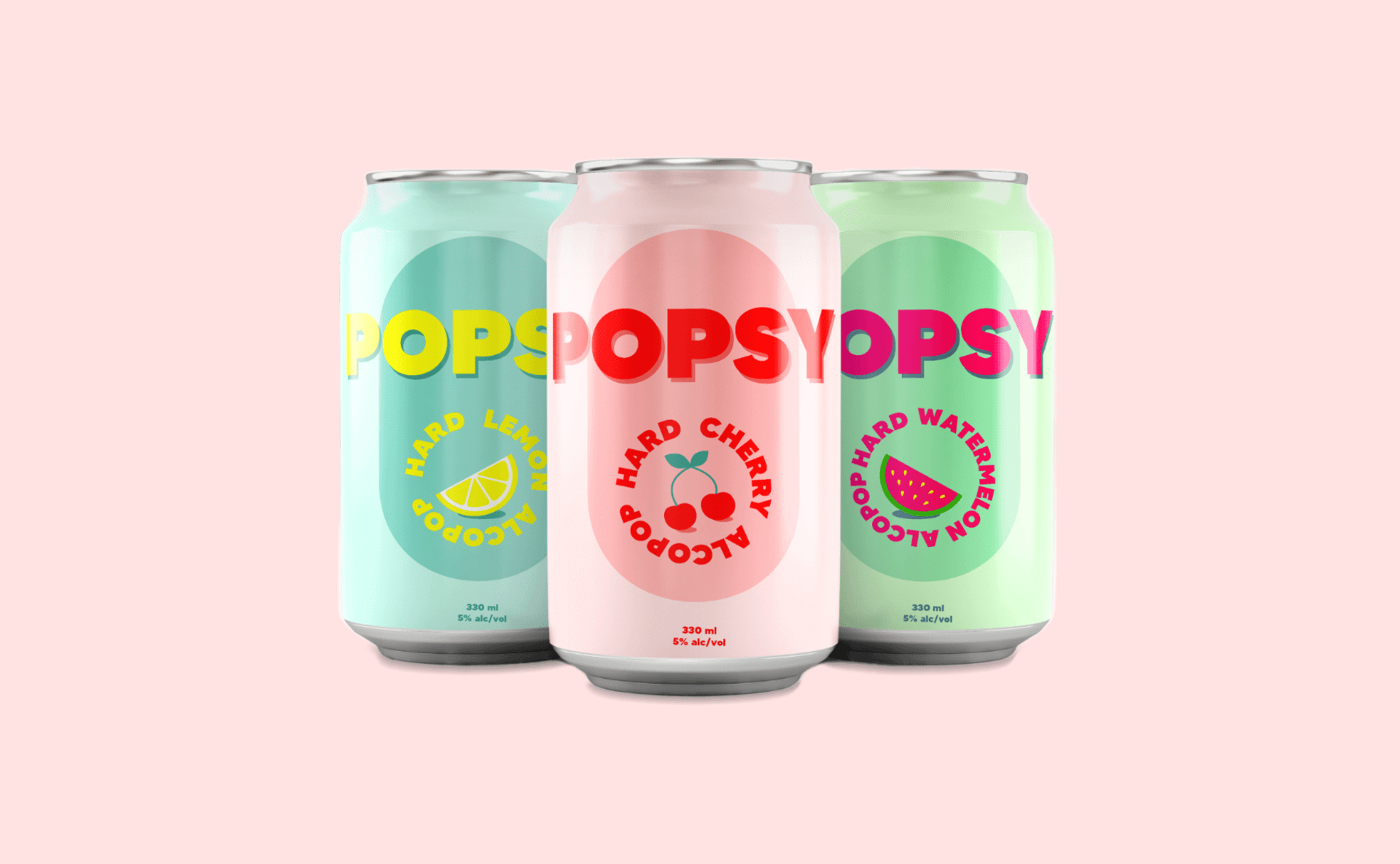
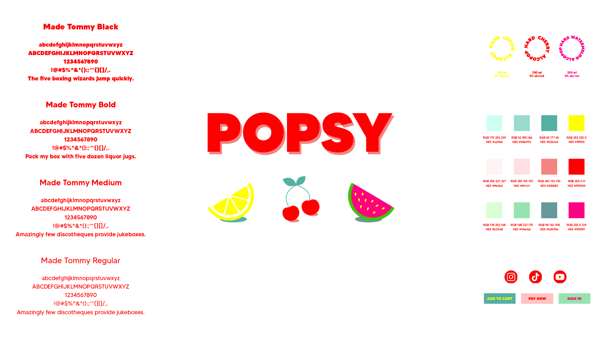
I targeted women aged 19-30 and created a vibrant logo that changes color based on the drink flavor. The can artwork for 3 flavors has a modern, clean style with bold colors to captivate the target audience and set the foundation for the prototype design.
Persona, Scenario & Flow
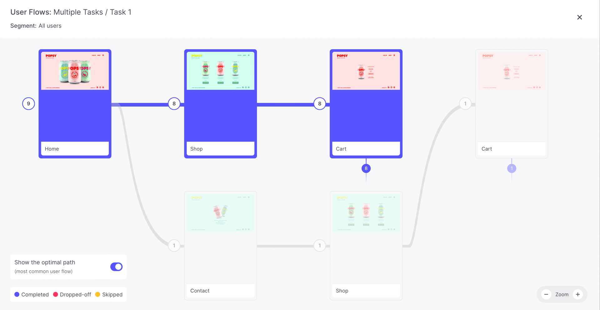
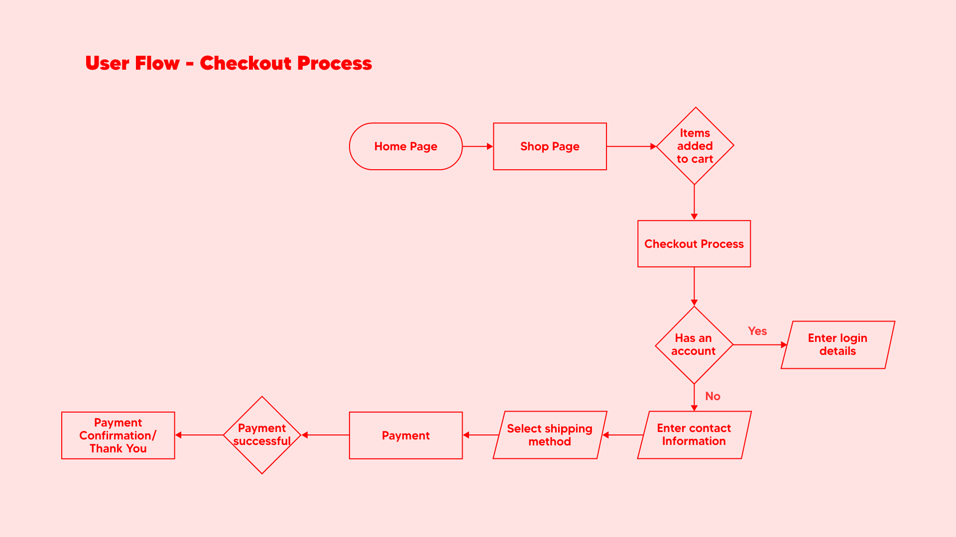
The User Persona represents the target market, portraying the ideal site user who aims to expand her following and collaborate with prominent brands. She faces challenges in discovering new, exciting brands for her social media and dealing with algorithm restrictions. The User Scenario outlines her journey from clicking on a banner ad to completing the checkout on the website. The User Flow illustrates the steps involved in finalising the checkout and creating an account.
Prototype
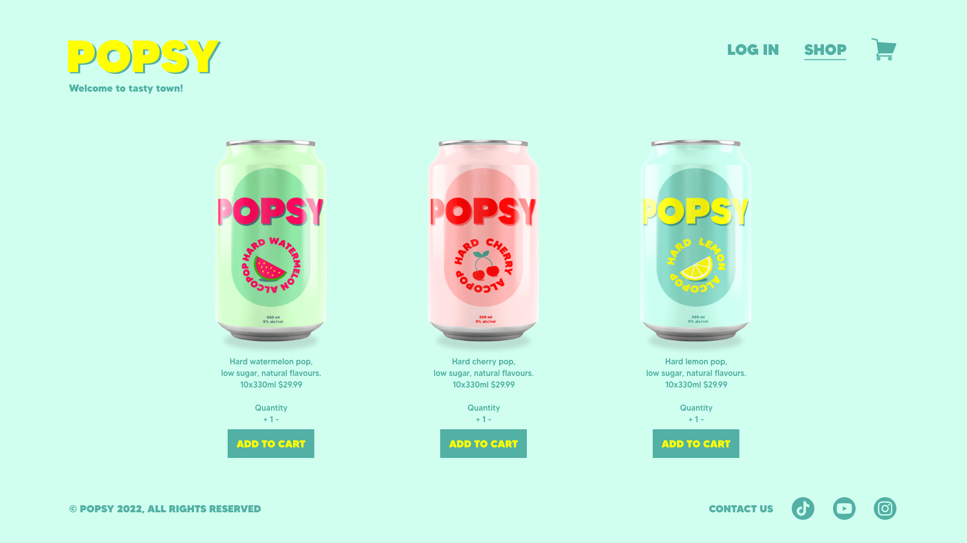
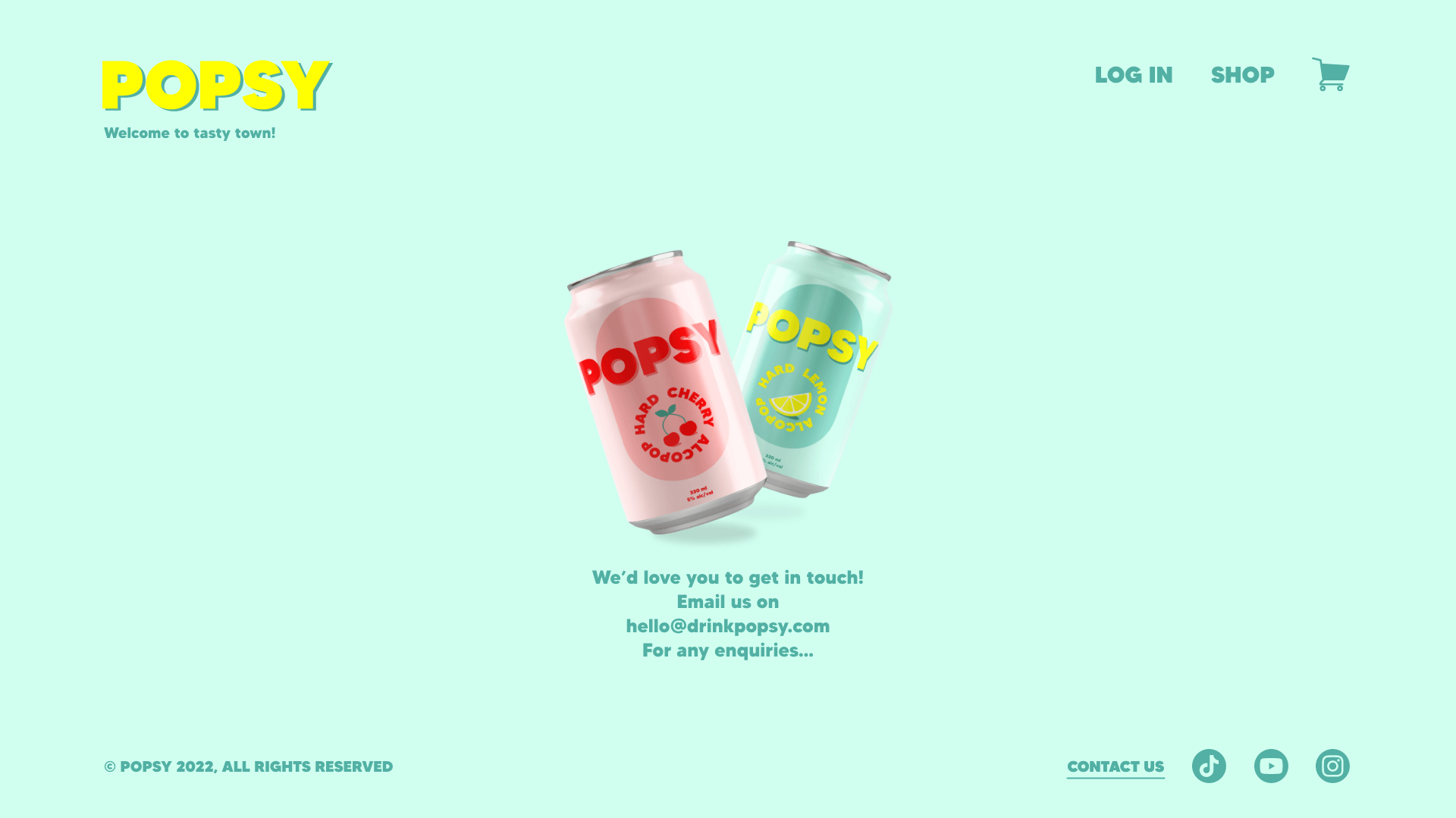
Using the brand design elements and the user flow, I laid out screens for each interaction required for users to complete the purchase and checkout tasks. I made use of white space to ensure users could focus on the tasks at hand and easily find buttons and navigation. I used the colour palettes of the different flavours throughout the website’s pages, in keeping with the lighthearted tone.
