PM Group Project | Ice Cream Social
Overview
A high-fidelity prototype of a mobile app for a fictitious business, to demonstrate the ux/ui design and project management skills acquired as a team using the Waterfall methodology, as well as my knowledge of the tools used.
Tools
Adobe Illustrator
Adobe InDesign
Figma
Role
Visual Designer
Project Goal
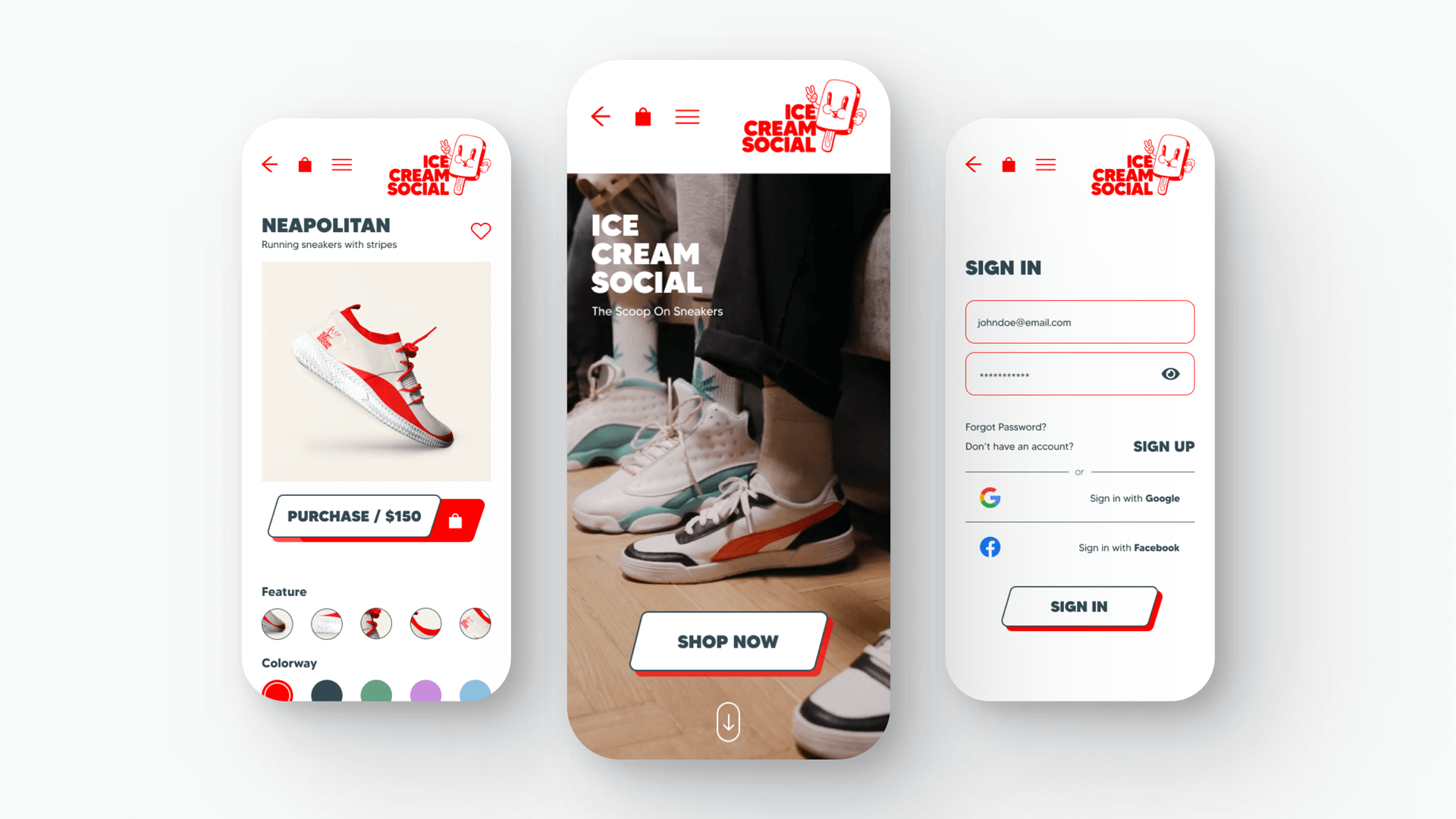
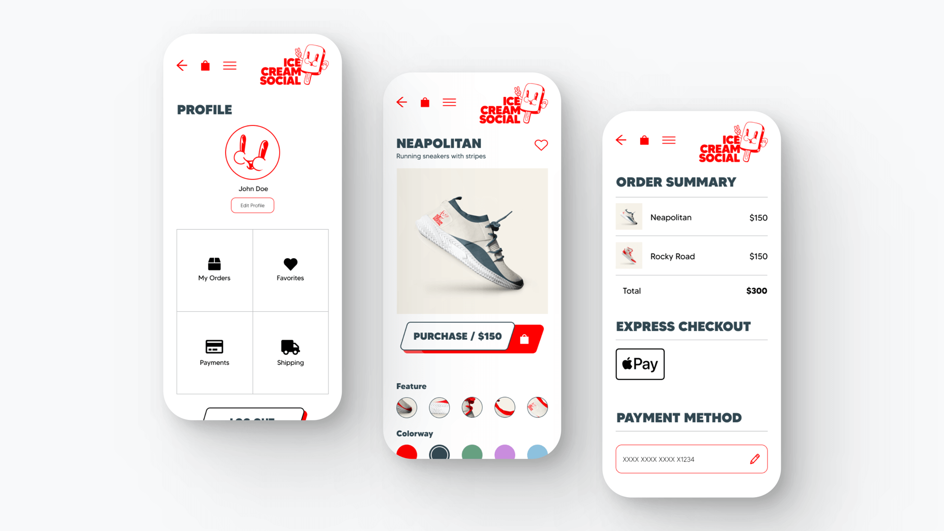
The goal of this project was to create a high-fidelity prototype of a mobile app for a fictitious business using Figma. This was a group project, and we followed the Waterfall methodology to complete it.
Brainstorming Process
As a team, we settled on our fictitious business for the app being an online sneaker store. We tested store names on students in our target audience age range (18-25), and ‘Ice Cream Social’ was the winner. Our target audience would be youthful sneakerheads and we wanted it to have a cool factor – as a sneaker brand, we’d need to be an authority on cool.
Logo Design
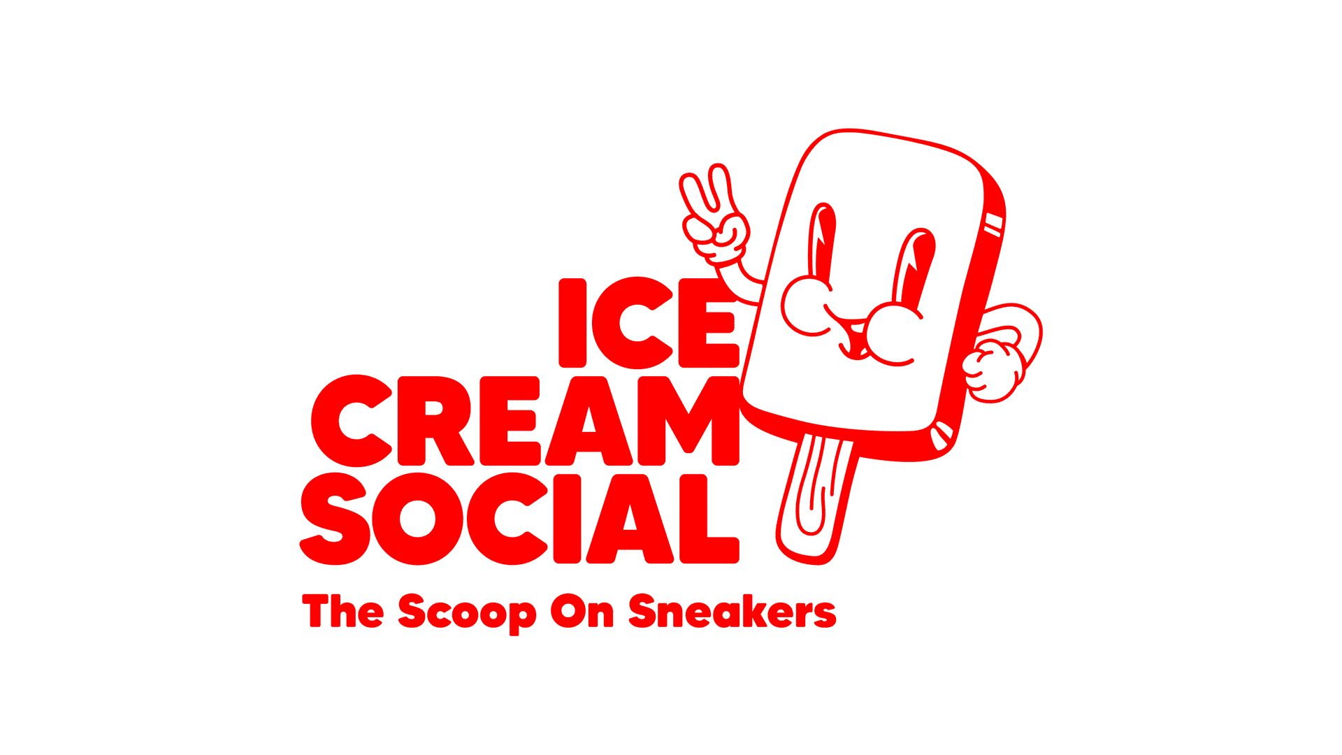
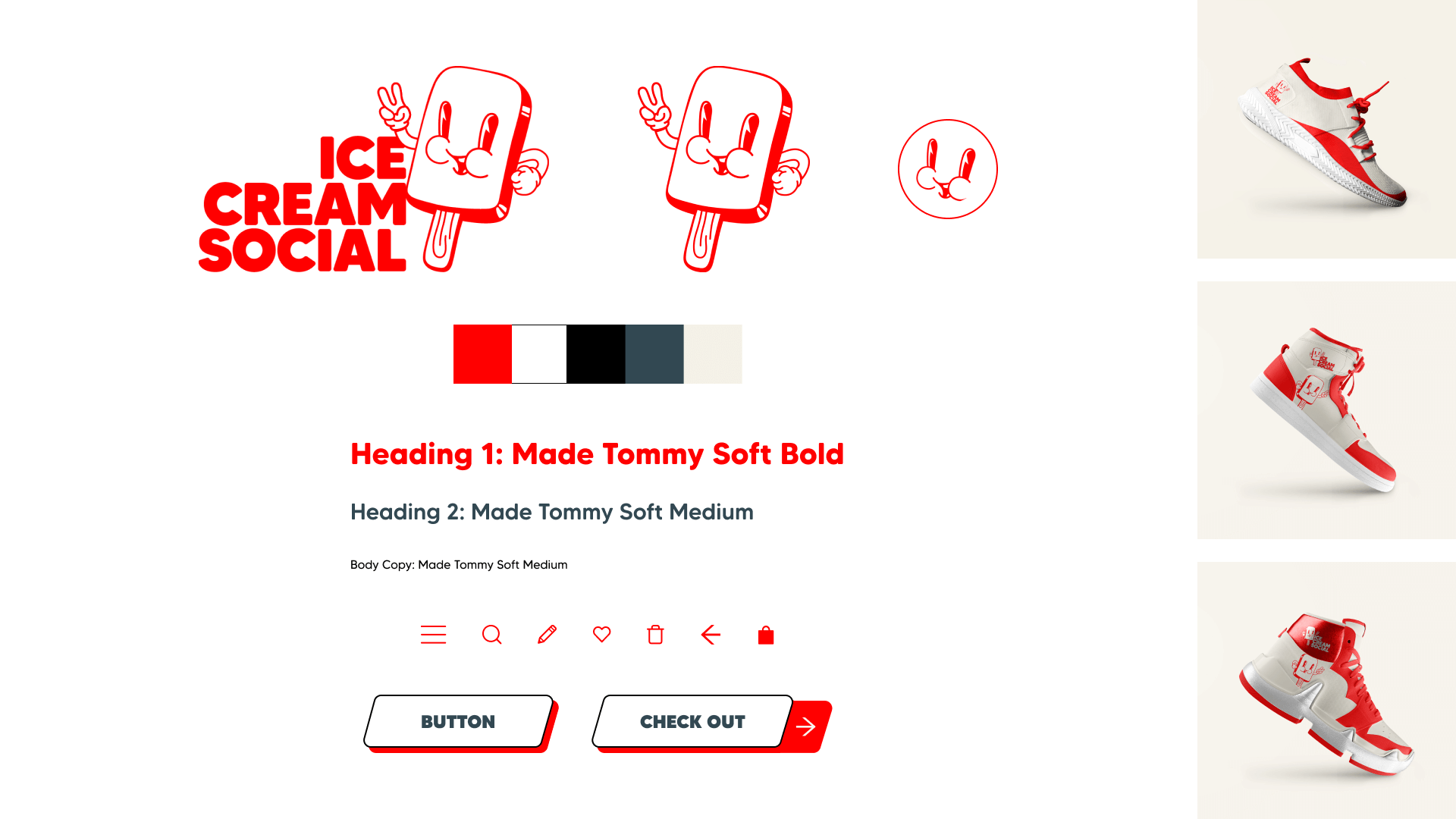
As the project's designer, my task was to complete the logo design and style tile, which would be handed over to the developers for the subsequent stages of the Waterfall process.Drawing inspiration from the brand name, I created an anthropomorphic popsicle mascot that embodied the brand's essence. To capture a retro-cool vibe reminiscent of 'rubber-hose' style illustrations, I designed the popsicle accordingly. To achieve balance and stability, I incorporated the brand name using a bold, chunky font.
Brand Design
I used the Made Tommy family to tie in with the logo. The brand colors draw inspiration from the retro-cool rubber-hose style, but I opted for a vibrant red to give it a modern and attention-grabbing feel. A deep green was introduced as a complementary accent color, with vanilla-cream for image backgrounds, as well as black and white. The icon family was kept simple to maintain a utilitarian aspect without overshadowing the design.
Prototype
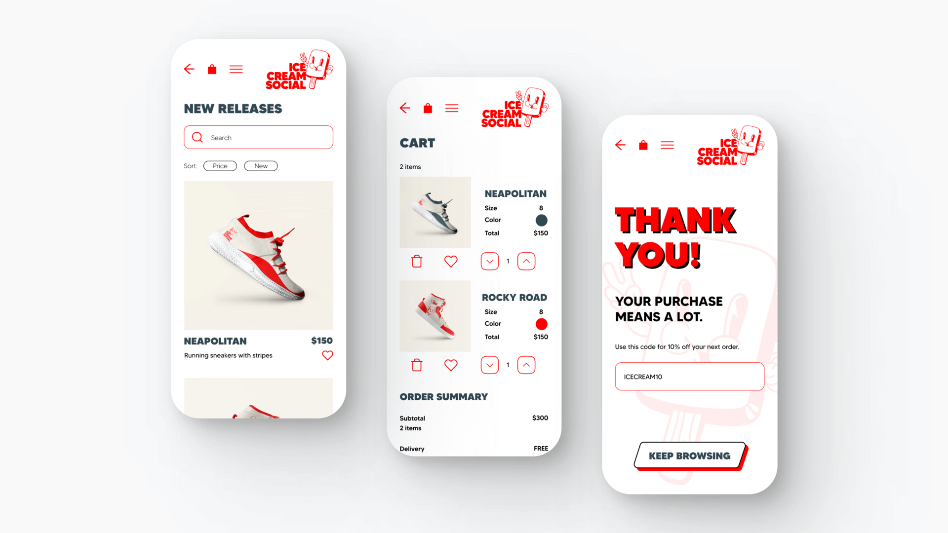
The app prototype was put together by the team, and I've revised it slightly to bring it closer to the design of the style tile and to have a clean and minimal UI. I also added some more white space.
- UX/UI & Developers | Austin Chiatto & DJ Park
- Project Manager | Sukhreet Brar
- UX/UI | Adelia Valitova
- Visual Designer | Nicola Bower