Logo & Stationery Design | Eat More PLants

Overview
I designed an identity and stationery suite for a vegan junk food brand.
Tools
Adobe Illustrator
Adobe InDesign
Role
Graphic Designer

Goal & Brainstorming Process
The project goal was to create a logo, stationery, and menu for a vegan junk food brand called Eat More Plants, emphasizing an approachable and friendly atmosphere.
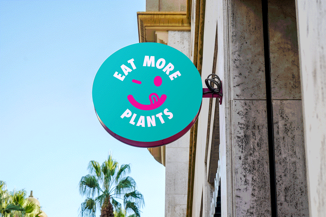
To challenge conventional plant-based brand imagery, I focused on the restaurant's name as a playful call to action. Taking inspiration from this cheeky tone, I designed a universal smiling face licking its lips to showcase the food's deliciousness, while winking at the viewer. The face is enclosed within bold, uppercase text.

Brand & Stationery Design
I used a bright colour palette that lives comfortably in the junk food world but still differentiates it as a vegan brand. I chose Made Tommy as the font family, as it's unfussy, easy to read, especially on a menu, and feels contemporary, like the brand.
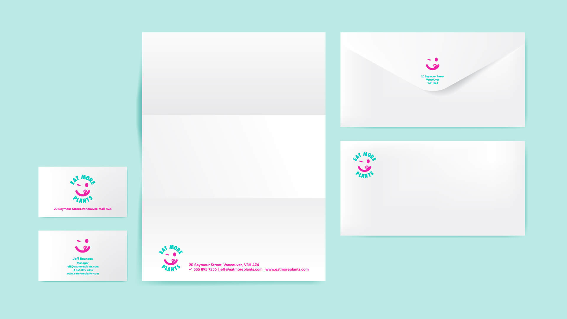
I kept the stationery design simple and functional. I applied the logo and key information to the various elements so that they are eye catching and easy to read, but most importantly, so that each piece of stationery serves its function.

Menu Design
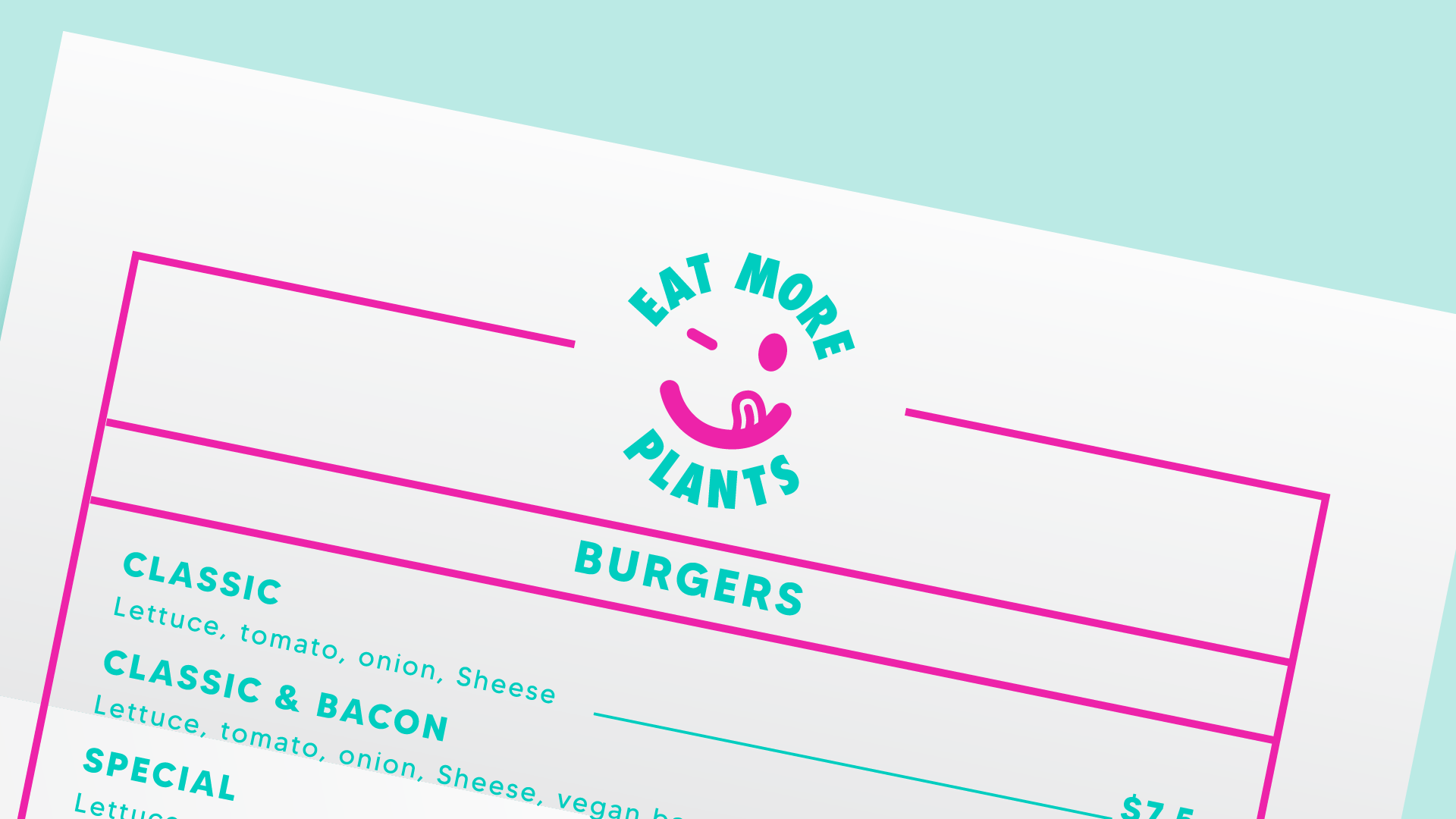
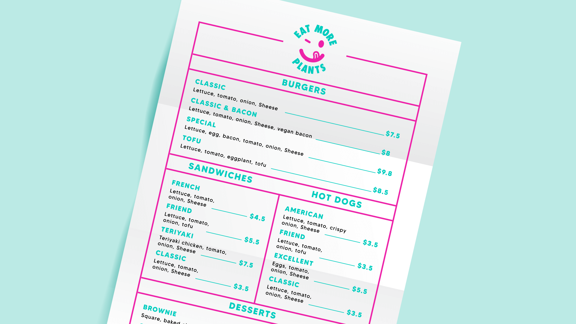
In keeping with the junk food genre, I designed the menu in a diner-style format that feels fun and ties in with the approachable and friendly tone of the brand.